

The Mercator Projection: Or How Humans Accidentally Made Greenland Look Important
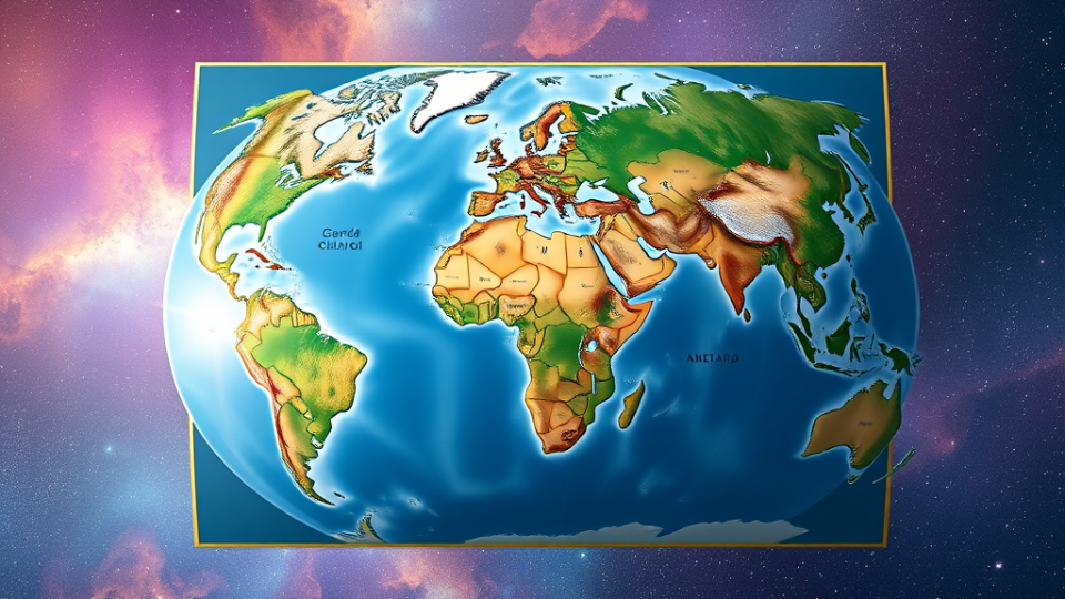
The Mercator Projection is a cartographic technique developed in 1569 by Flemish geographer Gerardus Mercator, who was attempting to solve the rather tricky problem of representing a lumpy sphere on a flat piece of paper—a challenge roughly equivalent to trying to gift-wrap a grapefruit using only a single Post-it note.
The projection works by imagining the Earth as a cylinder (which it demonstrably is not) and then mathematically stretching the bits near the poles until they fit. This has the unfortunate side effect of making Greenland appear roughly the same size as Africa, when in reality Africa could comfortably swallow fourteen Greenlands and still have room for pudding. It’s rather like taking a photograph of your cat and accidentally making its ears the size of satellite dishes—technically accurate in terms of angles, but somewhat misleading in terms of actual cat.
Why Humans Persist With This Nonsense
Despite its obvious geographical fibbing, the Mercator Projection became wildly popular among Earth’s seafaring nations because it possessed one genuinely useful quality: straight lines on the map corresponded to constant compass bearings. This meant that a navigator could draw a line from Portsmouth to Barbados, measure the angle, and sail in that direction without constantly recalculating. The fact that this made colonial powers’ territories look magnificently enormous while making equatorial nations appear disappointingly modest was considered by many historians to be a “happy accident,” though the nations in question might dispute the “happy” part.
The projection has clung to life well into the digital age, appearing in classrooms, boardrooms, and weather reports, giving generations of schoolchildren the impression that Scandinavia could take on South America in a fair fight.
What Other Galactic Civilizations Developed Instead
Most advanced civilizations in the galaxy never bothered with maps at all, having recognized early on that two-dimensional representations of three-dimensional spaces are about as useful as a chocolate teapot in a supernova.
The Vl’hurgs of Vl’hurg Prime developed what they called “Probability Clouds”—shimmering, holographic representations that showed not where things were, but where they were likely to be, accounting for continental drift, tectonic activity, and the tendency of their cities to wander off when nobody was looking. This proved remarkably effective until they discovered that observing the Probability Cloud collapsed the probability wave, causing several major cities to suddenly relocate to their least likely positions. The resulting insurance claims bankrupted their civilization for three centuries.
The Silastic Armorfiends of Striterax never developed maps because they never developed the concept of “somewhere else.” Their entire civilization existed in a state of militant solipsism, believing that anywhere they weren’t currently standing didn’t exist. This made navigation refreshingly simple, though it did make interstellar trade somewhat challenging.
The Dentrassi (the same species that works in the Vogon Constructor Fleet kitchens) developed edible maps made from compressed food paste. These were enormously practical for long journeys, as one could simply eat the portions of the map one had already traversed. The system fell out of favor after several notable incidents where hungry navigators ate their destinations.
The Hooloovoo (a super-intelligent shade of the color blue) developed what can only be described as “chromatic navigation,” representing locations as subtle variations in hue. This worked perfectly for them but was completely useless to everyone else, rather like trying to navigate using a map written in a color you can’t see. Which, for the Hooloovoo, was rather the point.
Galactic Navigational Challenges
The Mercator Projection’s distortions pale in comparison to the navigational nightmares faced by civilizations attempting to map the galaxy itself.
The Expanding Universe Problem: Any map of the galaxy is out of date the moment it’s created, as everything is rushing away from everything else at speeds that make a mockery of cartography. It’s rather like trying to map a party where all the guests are running away from each other while the room itself gets bigger. The Galactic Cartographers’ Union solved this by simply adding a disclaimer: “You Are Here (Probably) (Maybe) (Were).”
The Plural Zone Paradox: Certain regions of space exist in multiple dimensions simultaneously, meaning they appear in several places on the map at once. The Plural Zones of the Xaxis Nebula, for instance, require maps with footnotes, appendices, and a rather apologetic introduction explaining that yes, you really can get there from here, but you’ll also arrive somewhere else entirely, and possibly before you left.
The Somebody Else’s Problem Field: Entire planets and star systems protected by SEP fields simply don’t appear on maps because the cartographer’s brain slides right past them. The most famous example is the planet Brontitall, which doesn’t appear on any map despite being the second largest planet in the galaxy, because everyone assumes somebody else has already mapped it.
Temporal Cartography: Some civilizations exist slightly out of phase with normal time, meaning they appear on maps of last Tuesday or next Thursday, but never today. The Jajazikstak people solved this by publishing their maps in the past, but this created a thriving black market in antique atlases that showed the future.
The Galactic Positioning System (not to be confused with Earth’s GPS) attempts to address these challenges by providing coordinates based on the position of the Restaurant at the End of the Universe, which, being at the end of time, at least has the courtesy to stay put. Unfortunately, this means all coordinates are expressed in relation to something that won’t exist for several trillion years, making them technically accurate but practically useless—rather like the Mercator Projection, really.
In conclusion, the Mercator Projection represents humanity’s charming attempt to flatten reality into something manageable, even if it means making Greenland look like it could arm-wrestle Africa. It’s a testament to the human ability to create a useful fiction and then forget it’s fiction—a skill that has served them equally well in cartography, economics, and the belief that they’re alone in the universe.